If you want to play the game – Ivo Peg Solitaire, it’s available here: http://pegsolitaire.ivaylopavlov.com
On my journey to try out new technologies and languages,
the next stop after the IvoTetris Game built in Angular and TypeScript, was React and ES6.
I got the online course on React on Udemy from Max and wanted to build something simple but in the same time useful. So browsing through old games from my childhood I stumbled upon Peg Solitaire and Tower of Hanoi, so I picked the Peg Solitaire. It was ideal for my purpose and was suitable for playing on a phone.
After finishing the 200+ lectures on React, Redux, React DnD, reading quite a bit of documentation and Stack Overflow and 3 weeks of after work playing around I finished the game.
So here are my findings:
React feels like what HTML6 should be
I found React to be much easier and faster to pick up and get from 0 to usable level than Angular. It feels like it’s endorsing the NodeJS philosophy one step further, it is also the younger framework, which explains it. The other thing is, at the moment it does have the most lively ecosystem of packages that extend it. I used React DnD (Drag & Drop) and Material UI packages, to keep the styling nice. I didn’t use any other direct dependencies. The reason I think it’s easier to pick up is its structure to pass data back & forth between components. If you want to go advanced and modify behaviour based on lifecycle hooks, you can go it. In Angular you are presented with the deep end from the start, so it takes longer to learn how to pass data correctly between components.
I still hate CSS and Cross-browser support
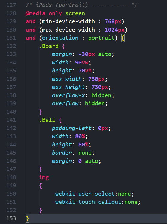
12 years since I first embraced web development and it feels like CSS has just piled up on the mess it already was. There are nicer things, like transform, etc. However, managing styles per component and multiple pages is the easiest thing to get out of hand. React and JSX has somewhat helped alleviate the struggle. It does require to edit the default packaging configuration to make the CSS-styles component-wise. Ironically, my new favorite browser is Edge. My pain this time around was Firefox, which doesn’t render empty lines, so I had because of 2 empty lines to re-write padding and margin specifics for an hour to make it look consistent. This was the only time I consider wasted from the entire effort spent on the project. CSS discoverability is aweful. Previews are inaccurate on emulators. The only blessing was the Chrome’s console and showing the applied styles. Being obsessed about pixel perfect position doesn’t help either, at one point you have to cut your losses and pick 2 browsers and platforms it shows well and the rest to be on best effort.
Centering a relative dimensions DIV is still an achievement, even in 2018
The fact that there is an entire flow-chart-like page dedicated to centering on CSS-Tricks, shows the age-old problem of centering stuff correctly. Sometimes it feels like you need a PhD in maths to get the proportions right, 40% of the 70% of the 100% of the View port. Best of luck setting the margin and padding correctly to have the thing scale proportionately on multiple screens.
Media queries and Mobile support
The thing I’ve never worked with before was media queries. That one was another puzzle to solve. If you cover iPhone X to display correctly, somewhat the iPhone 6 layout messes up. If you don’t have proper CSS design from the start, these queries will not save you from your poor CSS design practices. On top of that, the only browser that has proper Mobile Preview support turned out to be Chrome. Edge still offers some ancient Windows Phones as previews, while Firefox’s preview is so limited in functionality, it feels like they just reduced the screen estate and that’s it. None of them offered a mode to show the browser navigation on iPhones for example to see the actual viewable height and width in a Mobile Safari, they all assume you are building an app that will use the entire screen’s estate.

Outstanding Visual Studio Code & Chrome Debugging
I can’t stress this enough, if there are 2 things that convince me that Microsoft understands developers it’s TypeScript and Visual Studio Code. The ecosystem, proving once again, is the key to success, the amount of useful plugins the Visual Studio Code Marketplace offers is great. The editor ships basically with all you need out of the box, absolutely minimal setup required. I can officially say it’s taken over Sublime as my primary editor for over a year now. The integration with Chrome Debugging essentially seals the deal. It’s one of the few projects where I’ve actually used proper debugging techniques rather than just print statements, as it actually works. React’s plugin for Chrome also bumps the level of transparency of the objects you work with. Chrome has been getting a lot bad press lately for the bloated browser it has become, but it’s the best when it comes to its developer tools. I’m rooting for Microsoft to catch up with Edge on that front.
Importing images in React
Importing an image in React is like importing a module. It feels like it’s a good practice, if you move the image into a different folder, Visual Studio Code will update all your import statements to reflect the new path. Feels a bit hacky though, because you only abstract of the image source path. All other settings – width, height, alt and the rest are still in-place in the object. I’m still a bit conflicted on actual use beyond syntax consistency, as images are indeed a form of dependency for a project so that’s where their place should be.

TypeScript vs ES6
I love TypeScript, it’s the C++(fication) of JavaScript. The syntax is clean is probably what JavaScript should have been from day one. No wonder in this year’s Stack Overflow survey TypeScript is developer’s favorite language. ES6 tries to solve the same problem, similar syntactic sugar, lambda syntax, etc. but the propTypes object at the end of every file feel like a TypeScript Definitions file dumped at the bottom of every component. Yes, it’s not native in ES6, so developers have made the best for ES6 with a package, which just shows the TypeScript design still reigns supperior in my eyes, or maybe it’s just confirmation bias.
React DnD & Decorators
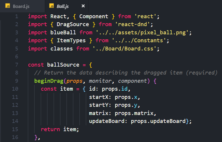
Building Drag & Drop Frameworks is one of the most non-trivial thing in computing. So building one from scratch was pointless. A quick Google search revealed React DnD. I did the chess game exmample and read the documentation. Which explained the design philosophy and how to use. It is not the most straight-forward package to learn, but after I finished their examples it fit right into place. I never before that needed to use the concept of Decorators in a real-life project. But now having an object “decorated” with a drag and drop ability, made perfect sense. Decorators are cool. The framework supports multiple pluggable back-ends, so the one that I used that had support for touch was a Yahoo one. As the default HTML5 doesn’t support the cool stuff. It was a one line change after you’ve install the NPM package. This is the epitome of web development in 2018. Reusable, Pluggable, Replacable, Open source. With the downside being indirect dependencies in the hundreds of packages.
Material UI and Modals
In Angular using Material is taken for granted, in React, the framework feels much easier to use than in Angular. Step 1 – Paste these 2 lines in your index.html. Step 2 – import what you need. Step 3 – This is how you overwrite the styles. Step 4 – Done. Even something as a backdrop to display a rules pop up is a plain copy-paste and minimal editing. I can’t say this is any coding, as it’s butchering copy-pasting in its finest. But the end result is professionally looking buttons and popups. The only thing I couldn’t get to work is to adjust dynamically on mobile, despite following all internet threads on the topic. So in the end I made it Desktop/Mobile agnostic in size.

Google Analytics & Deployment to AWS S3 is a breeze
This is by far the easiest deployment I’ve ever done. I put the Google Analytics script to get viewership statistics in the index.html and ran ‘npm run build’. As I already had the domain from the blog, from the AWS Console I created a new S3 bucket, selected it’s Public and it’s going to host a Static Web Site. I uploaded the [i]build[/i] folder contents by dragging and dropping. Opened “Route 53” and added another alias for a hosted subdomain to that S3 bucket. Done. It took probably less than 10 mins from building with WebPack to having it runnable on pegsolitaire.ivaylopavlov.com. The barrier to entry to build for the web has never been lower.
The source is available here. I hope this post inspired you to try something yourself. If so, feel free to share it in the comments section below.
Until next time, Ivo!


0 Comments